Behrens&Rune
Behrens & Rune came to us with no name, no identity, and a clear gap in the market: skincare that looks considered rather than clinical or trend-chasing. We built the brand from the ground up, naming, visual identity, packaging, and guidelines, positioning it as a studio-grade line for people who want fewer products done well.
Brand Identity
Packaging
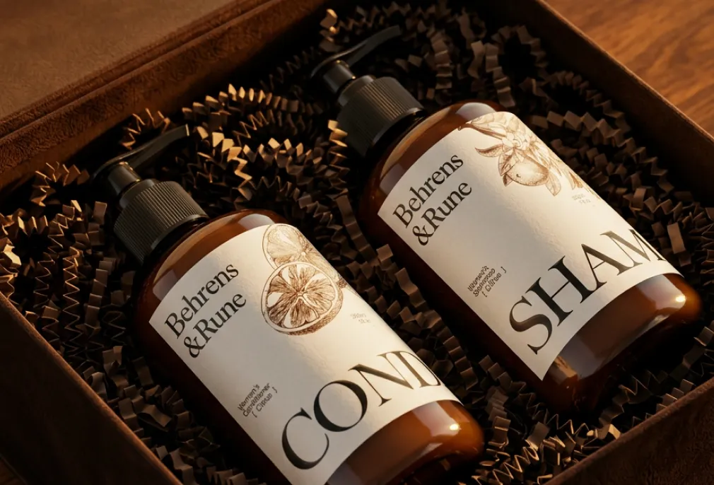
Packaging as a full unboxing experience
The brief wasn't just a bottle label. Every touchpoint a customer encounters from the moment the order arrives was considered as part of the identity. The delivery box uses dark kraft paper with black shredded paper fill — the kind of unboxing that signals premium before the product is even visible. The exterior is restrained, the interior feels deliberate. For a brand asking customers to spend more, the packaging has to justify the price before they've touched the product.
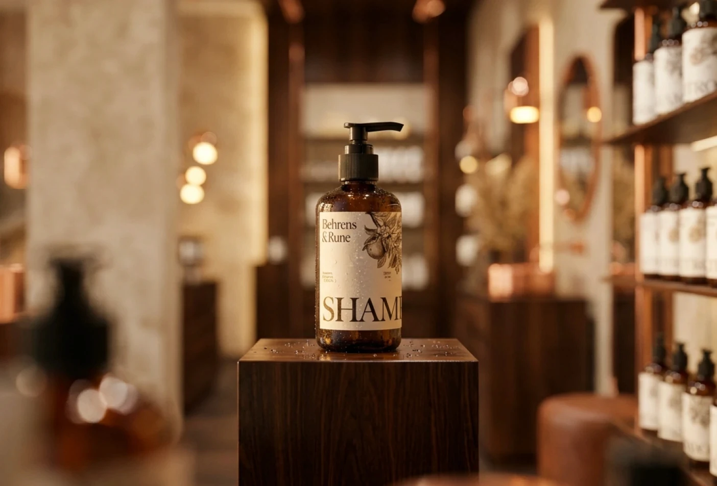
Retail presence and product placement
The visual direction was developed with shelf and counter placement in mind. Clean spacing, earthy tones, and minimal label information means the product holds its own next to established premium competitors without shouting for attention. Investment visuals showed the range styled in apothecary-style retail settings — dark wood shelving, soft directional lighting, sparse product groupings. The goal was to show investors exactly where this brand sits and that it belongs there.
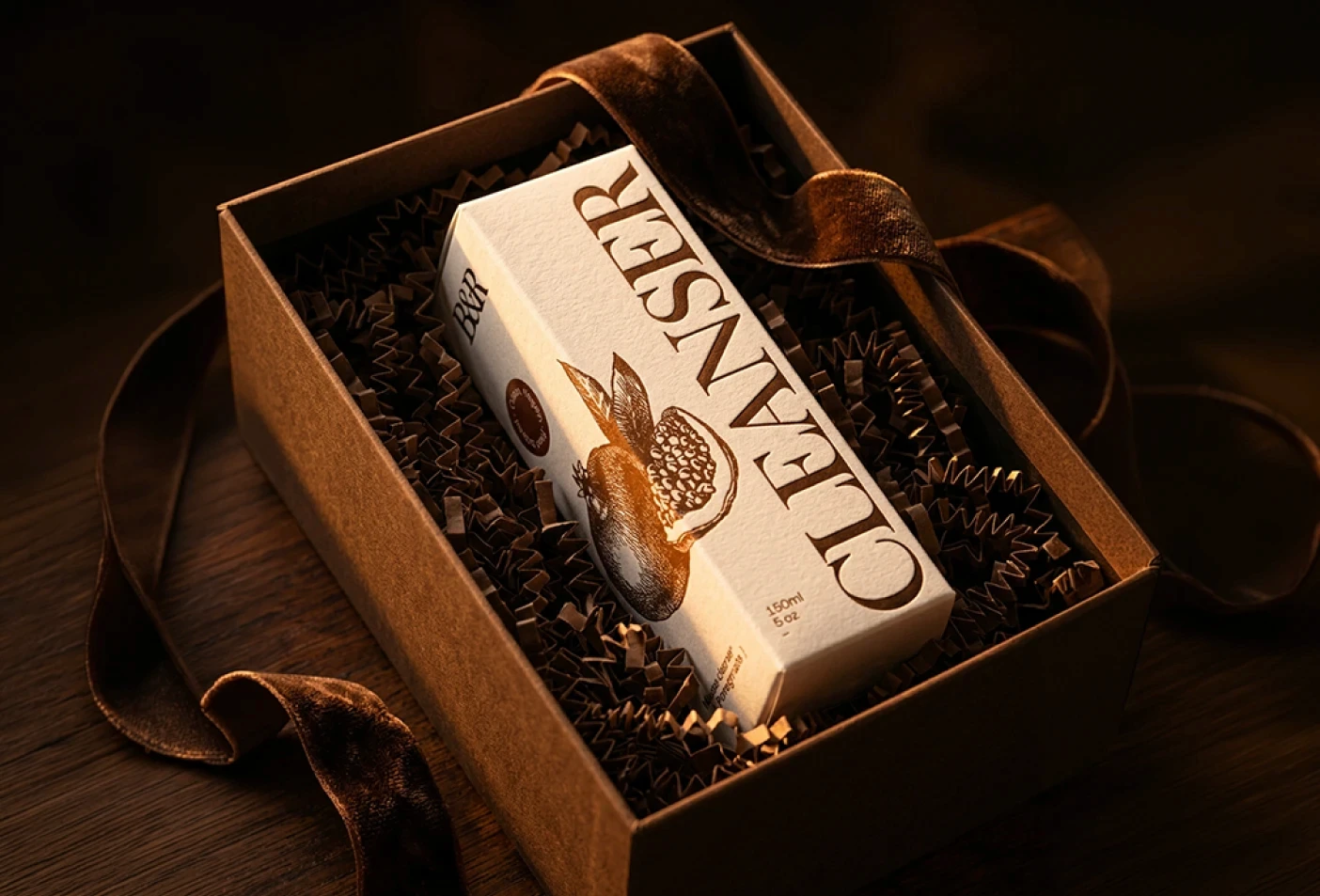
Label design with botanical line work
The box labels carry a single vector illustration of the hero ingredient — fruit or botanical — drawn to wrap around the corners of the packaging. The line work is fine and unhurried, sitting on a minimal background without competing with the product name. It communicates natural origin without resorting to the green-and-leaf visual language most skincare brands default to. Distinctive without being decorative for its own sake.

Material and texture as brand communication
On the cream glass tub, the label uses an uncoated paper stock that picks up texture under light. That tactile quality is part of the brand language — the label is meant to be felt, not just read. A smooth label on a glass tub is forgettable. A paper-textured one creates a moment of pause. The visuals showcased this specifically to demonstrate that the brand identity works across different substrates, not just on a flat screen.

Brand values rooted in simplicity and natural origin
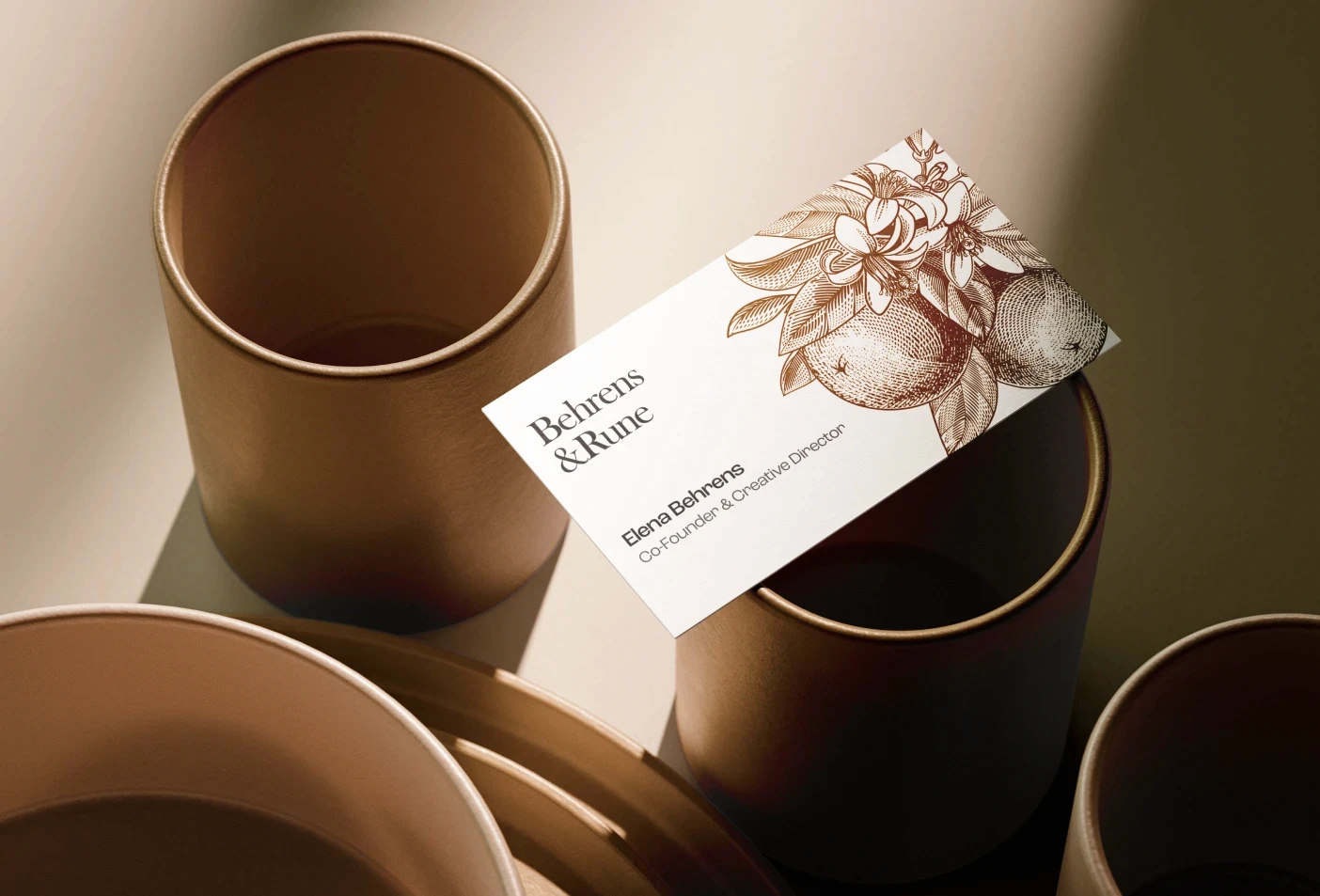
Behrens and Rune was positioned around three things: nature, honest ingredients, and restraint. No synthetic fragrance, no complicated routines, no cluttered messaging. The identity reflects that — earthy neutrals, minimal copy on every surface, and scent names described in single words. The brand values aren't stated loudly anywhere on the packaging. They're communicated through every material choice, every colour decision, and every line left off the label.
" height="183.00000212724035px" id="d30KPKjBf" transform="translate(0.5 0.5)" width="727.9999864551231px"/></svg>)